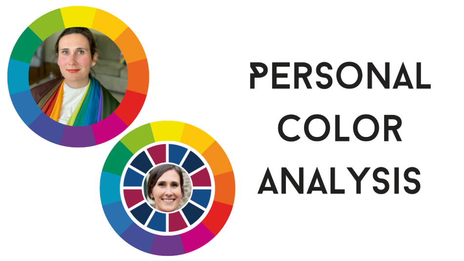
I Had Three Personal Color Analyses Done: Here’s What Each Revealed About My Closet
If you're curious about color analysis, keep reading.
If you’ve ever looked at someone and thought “She looks amazing,” it’s probably because she’s wearing her power colors. But how can you determine what colors you look best in? Color analysis!
Personal color analysis, or the art of uncovering what colors look best with your skintone, is having a moment right now. There are a few ways you can conduct an analysis, including in-person and online. Recently, I worked with both types of color experts to have an in-person and virtual analysis, but I also had artificial intelligence (AI) weigh in on the colors that look best on me.
Keep reading to learn more about what color analysis is and how to get your own personal color analysis done in person, virtually, or with AI tools.
Color Analysis Test: Three Ways To Do It
In-person Color Analysis: Meet with a color analysis expert and stylist like the ones at House of Colour. They’ll show you varying shades of warm and cool colors against your skin in the natural sunlight to find which ones look the best.
Virtual Color Analysis: After answering a short questionnaire about the colors you typically wear, your hair color, and how your skin tans and submitting seven photos of yourself in varying light, Color Guru will provide a Color Radiance Report.
AI Color Analysis: Using this TikTok as a guide, grab the hex colors of your skin, hair, and eyes, then input that information into ChatGPT to get the artificial intelligence’s thoughts on what you should wear.
My Personal Color Analysis Results
House of Colour Results: Autumn
House of Colour uses a methodology developed by the Bauhaus school of design founded in Germany. As my House of Colour stylists Colleen and Jill explained (and you can learn more about in the video below), there are warm colors and cool colors.
Warm colors have a bit of yellow in them, whereas cool colors have a bit of blue. The warm colors fall into House of Colour’s spring and autumn palettes, whereas the cool colors fall into the winter and summer palettes.
After trying a ton of variations of warm and cool colors, we discovered I look best in warm color tones. I wasn’t super shocked to learn I’m a “Warm Autumn,” a palette that contains many of the colors I gravitate toward when it comes to fashion, including olive.
What I was surprised to learn was my favorite color — what I often call my “spirit color” — chartreuse is also in House of Colour’s Autumn palette. They call it Lime Green, but it’s my favorite and I’m so glad to have it in my arsenal of colors I look best in.
In-Person Color Analysis
House of Colour
Private Session with House of Colour, $310
What's Included
- Draping process
- Makeup lesson
- Personalized color rating
- Seasonal booklet & fabric swatch fan
Pros: You get to see how different colors transform your appearance right before your eyes.
Cons: There may not be a House of Color stylist in your geographical area.
Working with House of Colour, I also got to know what colors don’t work so well with my skin, including the light purples and pinks of the world. That’s not to say I look “bad” in these colors, but more-so to say I don’t look my best.
That’s what color analysis is all about — finding the colors you look and feel best in. And I can honestly say I feel right at home with the colors in Autumn, but I’m not limited to them! That’s one of the most important things to take with you if you have a color analysis done. You’re not limited to the colors you look best in; they’re just a helpful suggestion.
House of Colour’s process also involves a 90-second makeup routine. Again, this is rooted in color theory and clues you in to which foundation, lipstick, and blush shades you look best in based on your season.
Jewelry is another thing that’s touched on in your color analysis. Autumns look best in gold and bronze-toned jewelry!
I left my in-person color analysis with my very own color wheel to take home and use to go through my closet (and peruse the racks of my favorite retailers). But I also left with a newfound confidence — I know myself better and what I look best in!
Color Guru Analysis Quiz Results: Twilight Winter
Color Guru offers three packages: The Essential provides you with a photo analysis, your color card (what you’ll use to go through your closet and buy clothing moving forward), and color radiance report. The second tier package includes all of that, a makeup card, and a consultation with Color Guru’s expert hair stylists. I opted for the Premium package and met with owner and Color Guru Jeannie in-person (these are normally done via Zoom!) to go over my results.
Before consulting with Jeannie, Color Guru’s stylists looked at the images I submitted and ran them through three tests to determine which colors looked best on me. Those tests included:
- Warm vs. Cool
- Light vs. Deep
- Muted vs. Clear
According to Color Guru’s assessment, cool, deep, clear colors are more flattering on me. Diving a bit further, Jeannie explained I fit best in the Twilight Winter color category, which contains the deepest colors in the Winter palette, including colors like black, crisp white, and midnight navy. When it comes to jewelry, silver, white gold, and platinum are my friends.
This differed slightly from my House of Colour results, which surprised me! Still, many of the colors in the Twilight Winter palette are the colors I typically wear, albeit the cooler versions.
Virtual Color Analysis
Color Guru
Expert Color Analysis starting at $165
What's Included
- Photo Analysis
- Color Card Duo (Digital & Physical)
- Color Radiance Report
Pros: You can have color analysis done no matter where you live!
Cons: The analysis is based on several photos, which might not provide an accurate portrayal of your skin tone.
Just as I did with the colors in my House of Colour palette, I feel right at home with the colors in my Twilight Winter palette.
AI Color Analysis
Armed with the knowledge of color experts, I had to see what artificial intelligence had to say about my color story. Using an image of myself taken without makeup on in natural sunlight, I pulled the hex code (the HTML color code using hexadecimal numbers to represent values in binary code) for my hair, eye, and skin color. Here’s what I came up with:
- Skin tone: #D5B19B (a warm, peachy tone)
- Eye color: #82775E (a warm, muted brown)
- Hair color: #2F271B (a deep, cool brown)
Here’s what ChatGPT came up with for my color analysis:
“With this combination, you likely have a warm undertone to your skin, while your eye and hair colors lean more towards neutral to cool tones. Considering these factors, here are some color suggestions that might complement you well:
- Earthy tones: Colors like olive green, mustard yellow, and warm browns can enhance your natural warmth without overpowering your features.
- Soft neutrals: Soft, muted shades such as taupe, mauve, and dusty rose can provide a subtle contrast and highlight your natural beauty.
- Warm jewel tones: Rich colors like deep burgundy, burnt orange, and rust can bring out the warmth in your skin and eyes while adding depth to your overall look.
- Cool accents: While your overall palette leans towards warmth, adding touches of cool colors like slate blue or charcoal gray can create balance and interest in your outfits.”
AI’s results feel a bit scattered and overly generalized, but there’s a mix of my results from the two color analyses I had done by human beings.
Key Takeaways
Going into this, I expected each color analysis to turn up different results. They were all conducted in such different ways, how could they not?
What surprised me most about the two human analyses was one said I look best in warm tones, whereas the other said I look best in cool tones. What’s a girl to do?! Again, the purpose of a color analysis is guidance, not a hard and fast rule you have to follow.
Here’s what else surprised me most about my color analysis experience:
- Which whites look best on me. Twilight Winter says crisp white is my best, whereas Autumn leans toward creamier, pearl-like whites.
- Black isn’t a universal color. Contrary to popular belief, not everyone needs a “Little Black Dress” in their closet. I’ve always felt like wearing black washed me out and I’m still not sure how to feel about it, but Color Guru’s Twilight Winters look best in black, whereas House of Colour’s Autumns look best in the deepest browns.
- Red is everyone’s friend. There’s a shade of red in everyone’s color palette, but House of Colour believes “True Red” looks good on anyone (“Candy Apple” is in my Color Guru “Twilight Winter” palette!)
Working with House of Colour and Color Guru gave me the confidence to be more adventurous with the clothing I wear moving forward. For example, I’m not a person who wears a lot of pink. But I think that’s because I didn’t know which shades of pink work best for me!
Overall, I’m excited to start shopping! Thanks to my color analyses, I’ve added the following to my shopping cart:
Arianne Elmy Good Luck Dress in Refresh

Why I Picked It
- Off-white base with colors that’ll look great with my skintone
- Dramatic sleeves
Short Sleeve Flare Dress in Hot Pink Poppy

Why I Picked It
- The hot pink hue is something I’ve shied away from before, but it’s one of my power colors!
- A short sleeve dress is the perfect transitional piece for spring
Herringbone Twill Utility Pull-On Pant in Hazelwood

Why I Picked It
- This color feels right at home for me
- One of those versatile pieces that can be dressed up or down!
Sam Edelman Buckle Trench Coat in Orange Poppy

Why I Picked It
- The Orange Poppy color, which is a shade of orange that should look great with my skin
- Who couldn’t benefit from a great trench in the spring?
Im Serenity Plunge Longline Tank in Light Grey

Why I Picked It
- A neutral that won’t wash me out!
- Transitional piece I can layer in the spring and wear well into summer
Gwyneth Toulouse Floral Trouser Pant

Buy from I Love Tyler Madison, $55
Why I Picked It
- These pants are mostly navy, which is one of my “Better than Black” choices from House of Colour
- Cropped with plenty of stretch in the pull-on elastic waistband
Fields Jumpsuit Jade

Why I Picked It
- Cool, deep, clear colors per Color Guru’s suggestion!
- We love a pom-pom
Grace Slide Sandals in Citrine

Why I Picked It
- This is my color!
- These light-weight slides from oka-B are a must for me, who will be working poolside most of the summer
Color Analysis Near Me
Want to find out what colors will look best on you? Have a color analysis done! See if there’s a House of Colour Stylist near you or have your colors analyzed virtually from anywhere with Color Guru.
Happy shopping! For more of the latest and greatest in fashion, keep reading:
The Pioneer Woman Drops All-New Spring Home Items at Walmart Perfect for Gifting & Entertaining
Sneaker Expert Agrees: These On Cloud Shoes Are Perfect for Travel